The ShopWell theme offers a powerful mobile footer builder that lets you create flexible, responsive footers specifically designed for smaller screens.
⚙️ Footer Options – Choose Your Footer Type #
ShopWell supports two types of footer layouts:
- WordPress Widget-based Footers
- Elementor-based Footer Templates
Note: To use Elementor-based footer templates, make sure to set Footer Options to Footer Builder by navigating to:
Appearance → Customize → Footer → Footer Options
This setting enables the use of templates created in the Footer Builder with Elementor.
🔧 Breakpoint #
Define when the mobile footer replaces the desktop version by setting a custom breakpoint.
- To set it:
- Go to Appearance → Customize → Mobile → Footer → Breakpoint
- Enter the pixel width (e.g.,
767) where the mobile footer should activate

This ensures a seamless transition for mobile users.
🎨 Prebuilt Footer Templates #
ShopWell uses Elementor-based footer templates, created via the Footer Builder.
- To assign a prebuilt footer for mobile:
- Go to Appearance → Customize → Mobile → Footer → Prebuilt Footer
- Select your desired layout, such as
Footer Mobile V1
This allows quick application of ready-made designs.
✏️ Create a New Mobile Footer Layout #
Want to build your own mobile footer from scratch? Use the Templates > Footer Builder section.
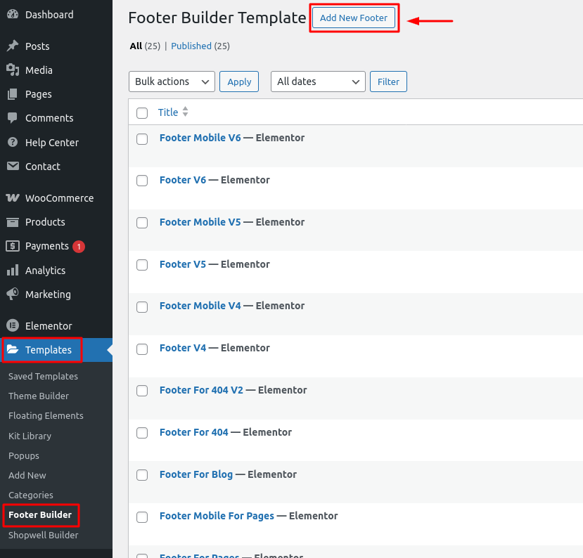
Steps: #
- Go to Templates → Footer Builder
- Click the Add New button to create a new footer template
- Give it a title
- Click Edit with Elementor to start building the layout visually
Use widgets, columns, and styling options within Elementor to achieve your perfect footer.
🛠️ Edit an Existing Footer Layout #
You can easily update any of your saved mobile footer templates.

Steps: #
- Navigate to Templates → Footer Builder
- Hover over the template you want to update
- Click the Edit with Elementor link
- Modify the content, structure, or style as needed
Great for quick tweaks or rebranding efforts.
✅ Summary #
With ShopWell’s mobile footer system, you can:
- Set responsive breakpoints
- Use prebuilt templates or build custom layouts
- Easily edit templates with Elementor
This gives you full control over how your site looks and functions on mobile—no code needed!