Managing how your site appears on mobile devices is crucial for delivering a seamless experience. With the Mobile Topbar Settings, you can easily control the visibility and arrangement of the topbar on smaller screens.
🧭 How to Access #
To configure your topbar settings for mobile:
- Go to Appearance → Customize in your WordPress dashboard.
- Navigate to Mobile → Topbar.
- Use the options available to customize how the topbar behaves on mobile devices.
🚀 Available Options #
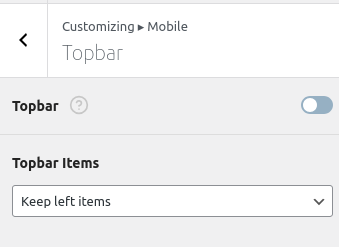
Topbar Toggle #
Enable or disable the mobile topbar entirely using the main Topbar switch.
- Enabled: Displays the topbar on mobile screens.
- Disabled: Hides the topbar on mobile screens.
Topbar Items #
Choose how the topbar content is displayed on mobile devices. Select from the following layout options:
- Keep left items
Only shows elements that are positioned on the left side of the desktop topbar. - Keep center items
Only shows items that are center-aligned in the desktop view. - Keep right items
Displays only the right-aligned topbar elements. - Keep both left and right items
Retains both the left and right content, hiding the center. - Keep all items
Displays all topbar elements: left, center, and right.
💡 These options give you fine-tuned control over what content is shown in the limited space available on mobile.
🎯 Why It Matters #
Optimizing the topbar for mobile screens helps:
- Improve clarity and navigation on small screens
- Reduce clutter by only showing essential elements
- Customize content layout to suit your branding and user needs