Header #
The Header panel in Blogsy controls your site’s main navigation bar, sticky behavior, menu cutoff, trending keywords, and header widgets.
Header overview #
The Header section is located at:
Appearance → Customize → Header.
From here you can choose a prebuilt header layout, enable a sticky header, control how many menu items are visible, and manage header widgets like Social Links, Search, Dark Mode, and Buttons.

Prebuilt Header #
- Prebuilt Header: Select a ready-made header layout (for example, “Header V1”) from the dropdown. There are 3 variations available in lite version of Blogsy theme.
- Changing this option updates the structure and position of logo, menu, and header widgets in one click, so you do not need to build the header from scratch.
Sticky Header #
- Sticky Header: Turn this switch on to keep the header visible at the top of the page while users scroll.
Menu cutoff #
- Enable menu cutoff: When enabled, Blogsy automatically limits the number of top-level menu items shown in the main navigation.
- Menu cutoff up to: Choose how many items you want to display (for example, 6 or 7). If your menu has more items than this number, the extra items are grouped into a “more” dropdown so the header layout stays clean and consistent.
- Menu cutoff text: Set the label for the dropdown that holds the extra items (for example, “More”, “Explore”, “Categories”).
- Users will see this label as a menu item; clicking it opens a dropdown with all overflow menu links.
Trending Keywords (Search enhancements) #
- Enable Trending Keywords: Turn this on if you are using the header Search widget and want to show popular search suggestions.
- Trending Keywords: Enter one keyword per line or separated by commas (for example, “WordPress tips, Blogging, SEO, Tutorials”). These keywords appear as clickable suggestions when the visitor focuses on the search input in the header, helping them discover content quickly.
Header Widgets #
At the bottom of the Header panel, you will see the Header Widgets area. Here, you can add or remove widgets that appear inside the header, depending on the chosen prebuilt layout. Click Add Widget to select from:
- Text: Adds arbitrary text, such as a short tagline, contact info, or announcement. You can use basic HTML if needed (e.g., links or line breaks).
- Social Links: Displays icons linking to your social media profiles. To know how to show your preferred social media links in header
Follow this guide. You can also choose the style and size of the social icons from the widgets. - Search: Adds a search icon or search field in the header. There are two variations available for search widget, (a) Inline and (b) Expand.
When combined with “Enable Trending Keywords”, clicking the search input shows your predefined trending keywords as suggestions, users can click to run a search instantly.
Note that trending keywords feature only works with Expand style. - Dark mode: Adds a toggle that lets visitors switch between light and dark modes for your site. The current preference is applied instantly on the front-end header.
- Button: Adds a prominent button with a custom label and link (for example, “Subscribe”, “Contact”, or “Buy Now”). This is useful for highlighting your primary call to action in the header.
You can reorder widgets within the Header Widgets area by dragging them, so you control the exact order in which they appear in the header and You can also choose the visibility of each widget across devices.
Footer #
The Footer panel in Blogsy controls the column layout, widget alignment, copyright text, and the back‑to‑top button for your site’s footer.
Footer overview #
Go to Appearance → Customize → Footer to configure how the bottom section of your site looks and behaves.
From here you can choose a multi‑column layout for footer widgets, center the content, set copyright text with smart tags, and enable a back‑to‑top button.
Column Layout #
- Column Layout: Choose how many widget areas (columns) your footer should have and how they are sized.
- Each layout preview shows the relative width of the columns, for example:
- 4 equal columns
- 3 columns
- 2/3 + 1/3
- 1 + 2, 2 + 1, etc.
- After selecting a layout, you can assign widgets to each footer column in Appearance → Widgets or in the Customizer’s Widgets section, and they will follow this structure in the front‑end footer.
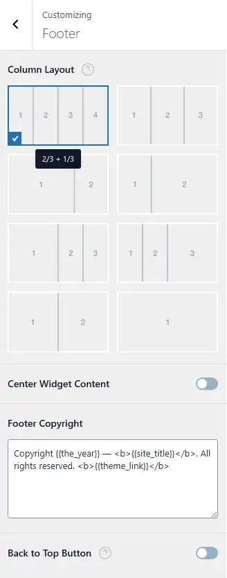
Center Widget Content #
- Center Widget Content: When enabled, the content inside each footer widget area is horizontally centered.
- This is useful if you have minimal content (e.g., just icons or a short text) and want a more balanced, symmetrical footer. When disabled, widgets follow the default alignment from your theme or widget settings.
Footer Copyright #
- Footer Copyright: This field controls the text that appears at the very bottom of the footer.
- You can use smart tags/placeholders that Blogsy replaces automatically on the front end, such as:
{{the_year}}– Displays the current year (e.g., 2025).{{site_title}}– Displays your site title from Settings → General.{{theme_link}}– Displays a link crediting the Blogsy theme (or your theme/provider link, depending on how you set it up).
Example (default):Copyright {{the_year}} — <b>{{site_title}}</b>. All rights reserved. <b>{{theme_link}}</b>
You can customize this text, add HTML tags (<a>, <b>, <span> etc.), or remove parts you do not need while keeping the placeholders you want.
Back to Top Button #
- Back to Top Button: Enable this toggle to display a floating “back to top” button on your site.
- When enabled, the button appears after the visitor scrolls down the page; clicking it smoothly scrolls the page back to the top, improving navigation on long posts and archives.
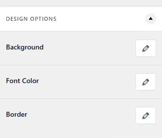
Header/Footer Design Options #
The Header and Footer design can be customized with various options:
- Background: Choose between solid color, gradient, or an image as the background.
- Border: You can select a top/right/bottom/left border, style, and color.
- Font Color: Customize the text color, link color, and link hover color.